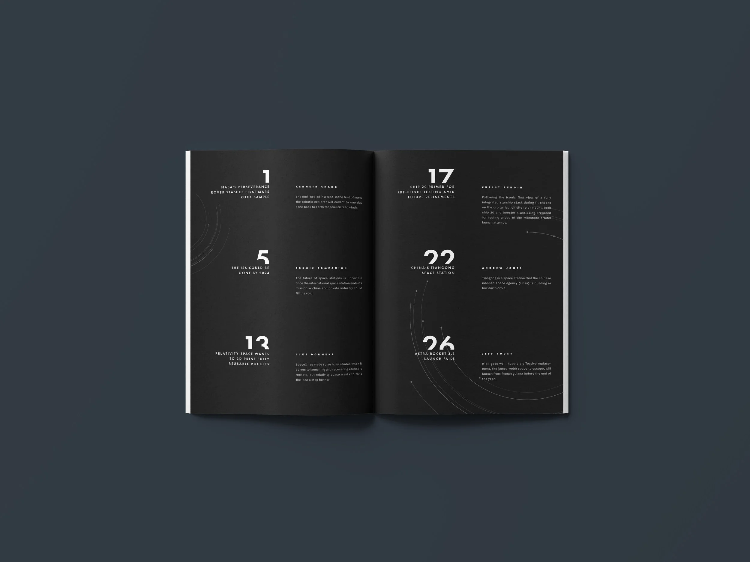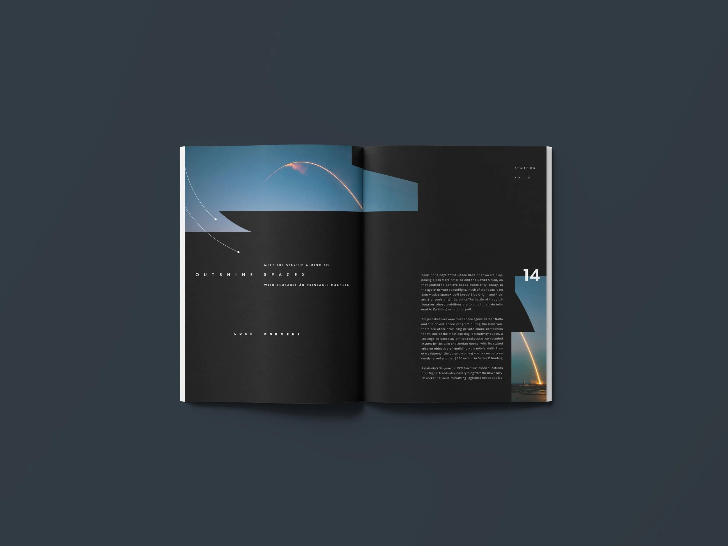
In Typography 3 class, I was instructed to create a fictional magazine. T-MINUS is a science and technology magazine about space exploration.
process
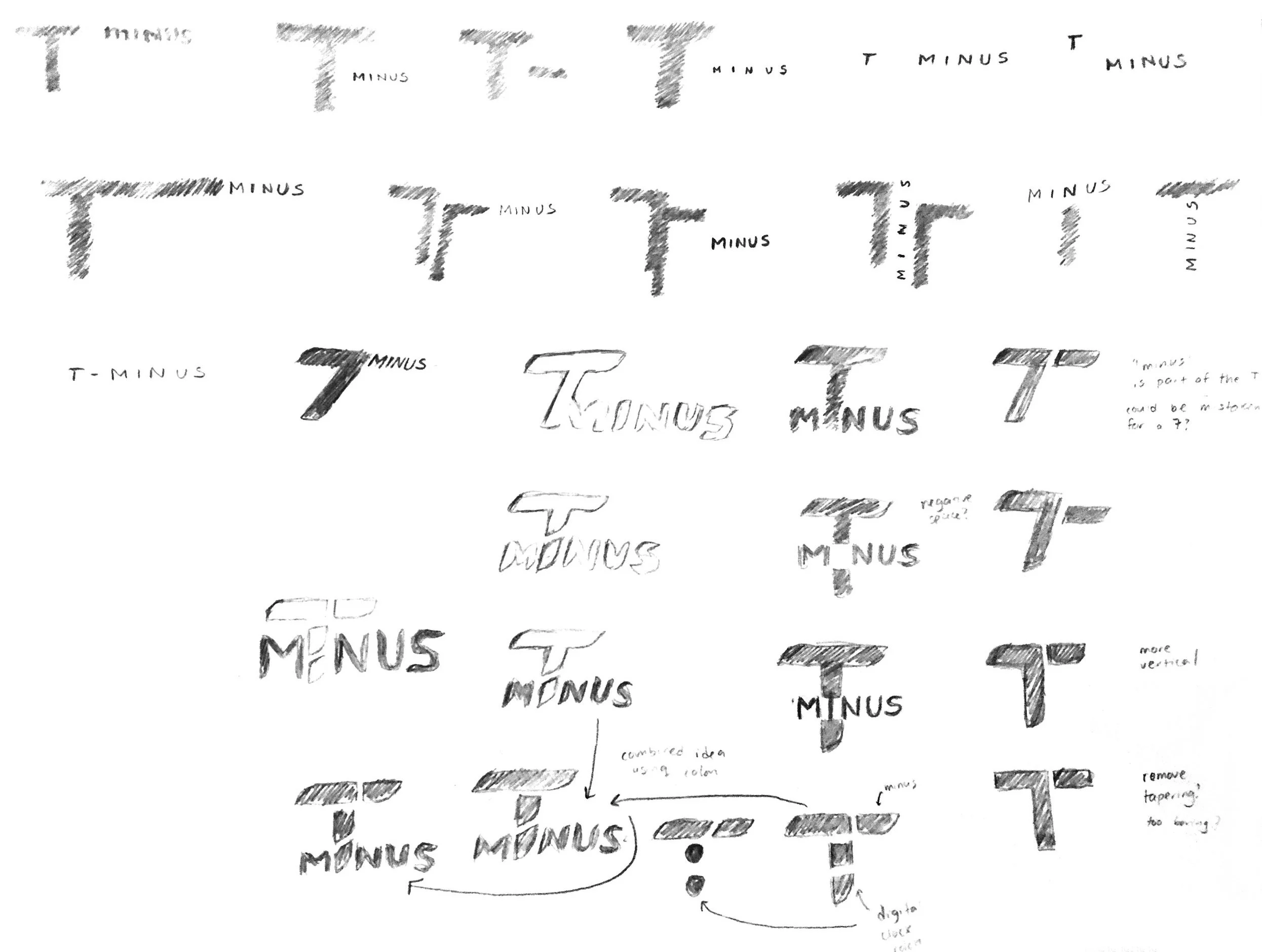
wordmark sketches
I explored ways to integrate movement that felt fast. I also explored how to create the feel of a clock since T-MINUS indicates the amount left before a rocket is launched.
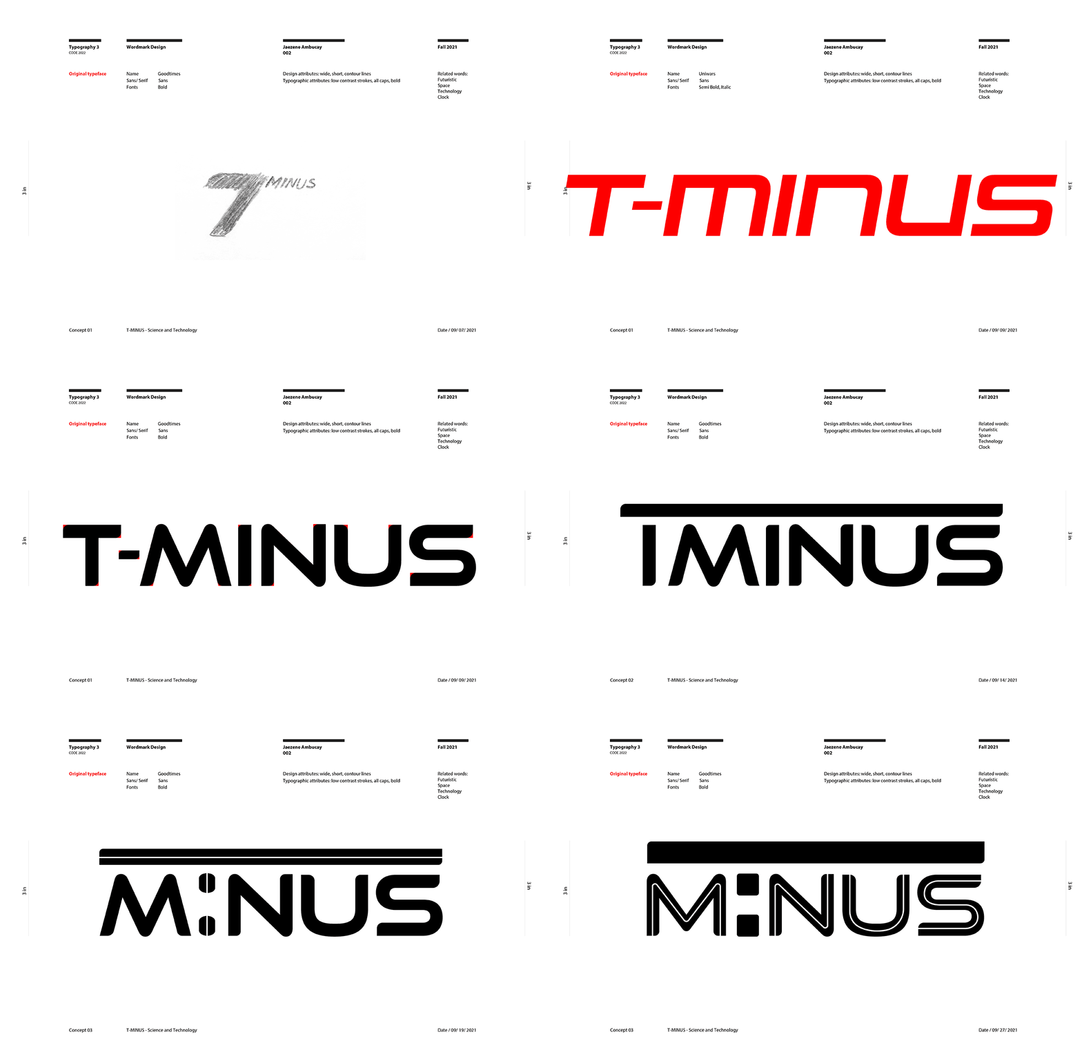
wordmark type studies
I did a type study to see whether a sans serif, serif, or display typeface would work best when applying my sketches.
wordmark digital iterations
I pushed my iterations to see how much detail I could add or strip away to achieve movement. After countless iterations, I decided that less was more. The small change of tapering corners did the job and complemented my visual system.
final wordmark
layout process gif
I explored how to make typography feel like space. Initially, I used larger type to emphasize excitement for new discoveries in space. After iterating more, I learned that using smaller type and white space gave an impactful feel of vastness. I established a circular grid system to further enforce the idea of space and aligned subtle graphics to complement the type.

