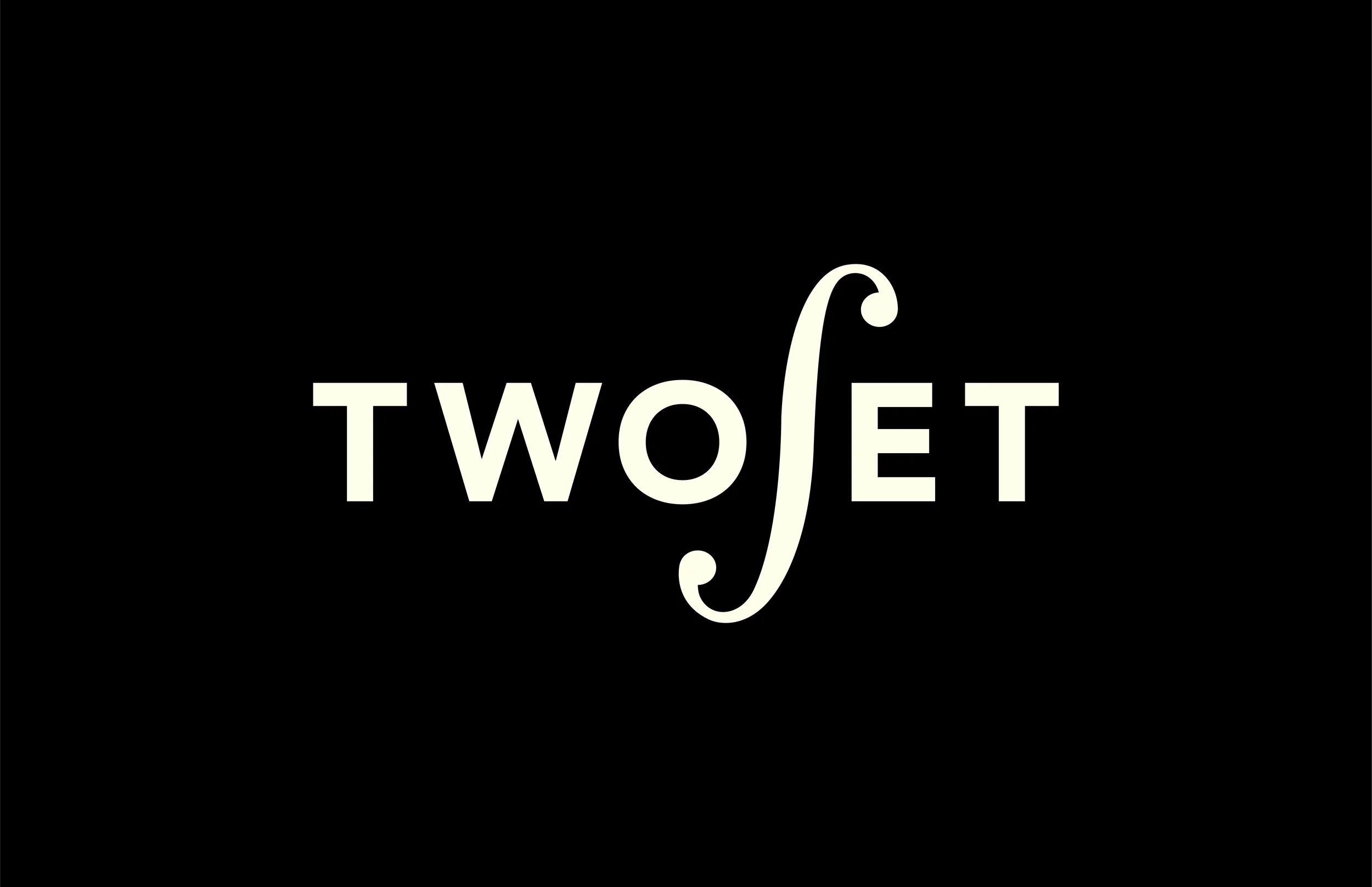
In Graphic Design 1 class, I was instructed to rebrand an existing identity to learn the basics of creating/applying a brand. I chose to rebrand TwoSet Violin in which their mission is to educate younger generations about classical music.
PROCESS
opportunity assessment
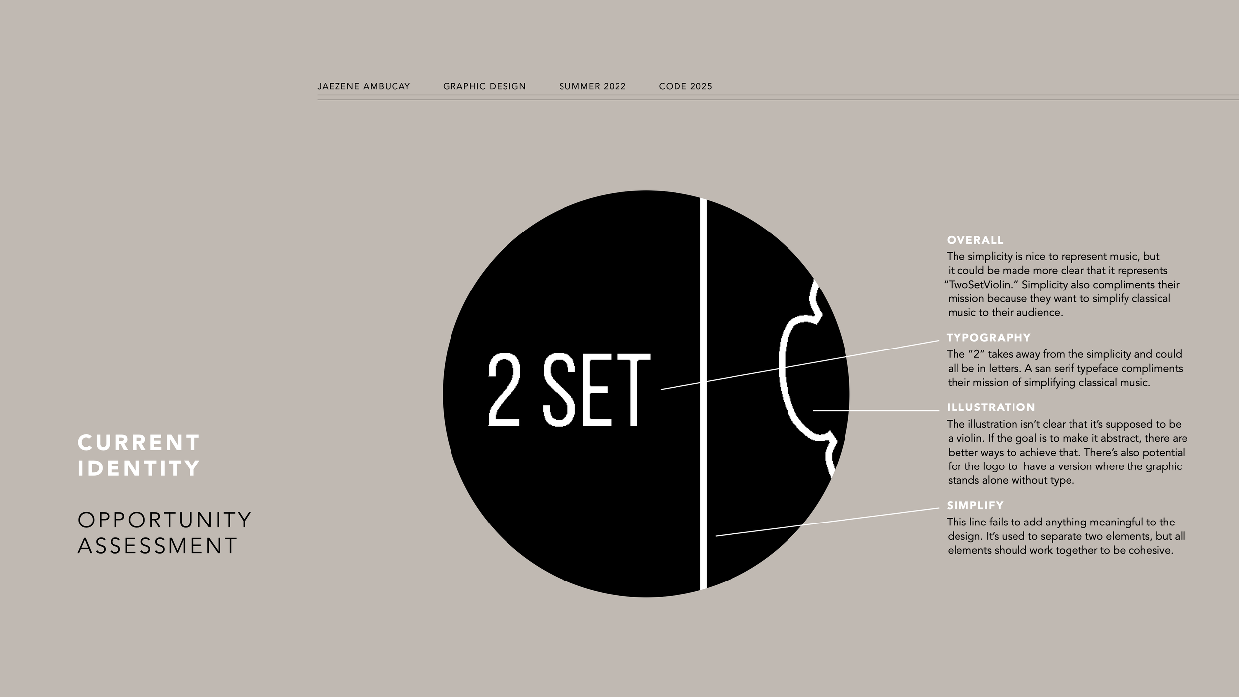
I conducted an opportunity assessment of their current logo to analyze where improvements could be made. The type and illustration is not cohesive and fails to communicate their mission. Overall, it does not fit the intended feel of their brand.
Sketching
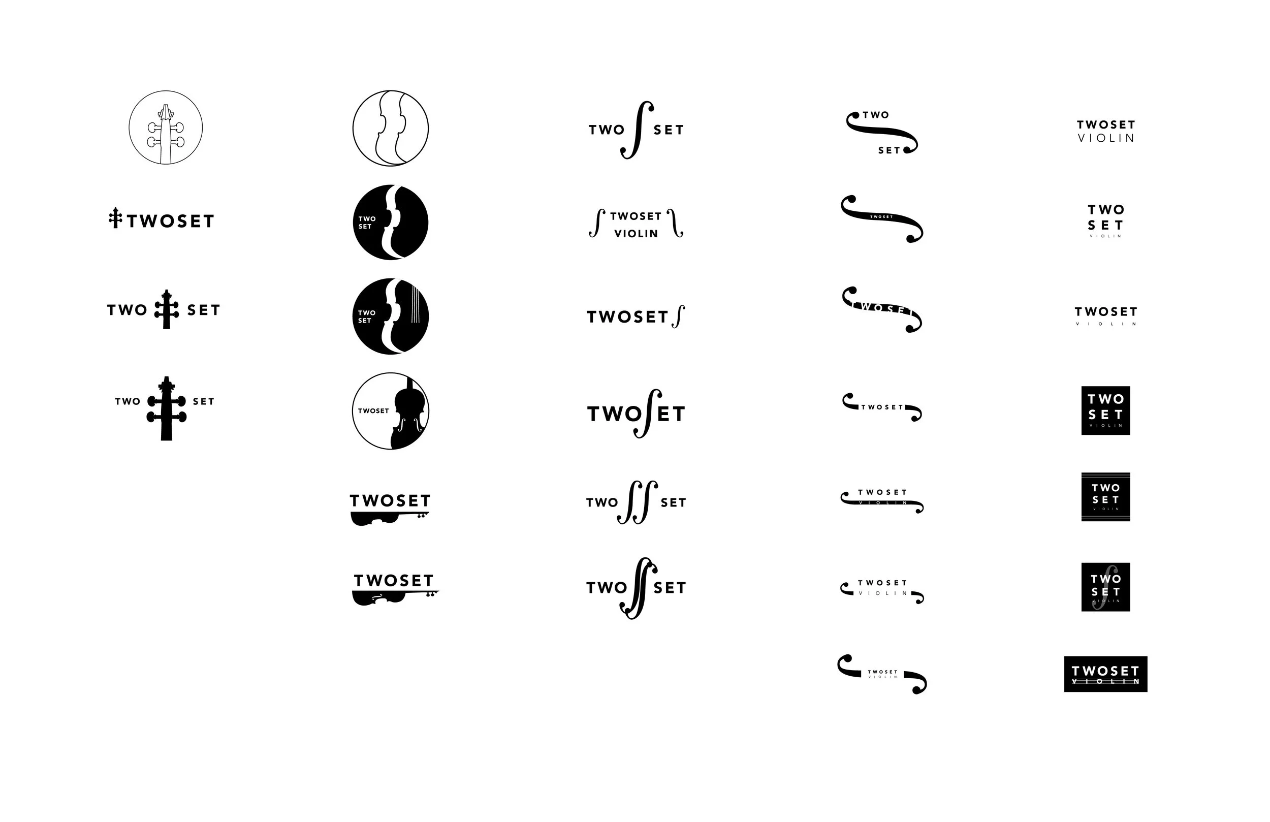
During my sketching, I ideated under these categories:
illustrative
implied
minimalist
digital iterations
While iterating, I played around with how much detail I could include VS how much detail I could strip away to still represent violin and music.
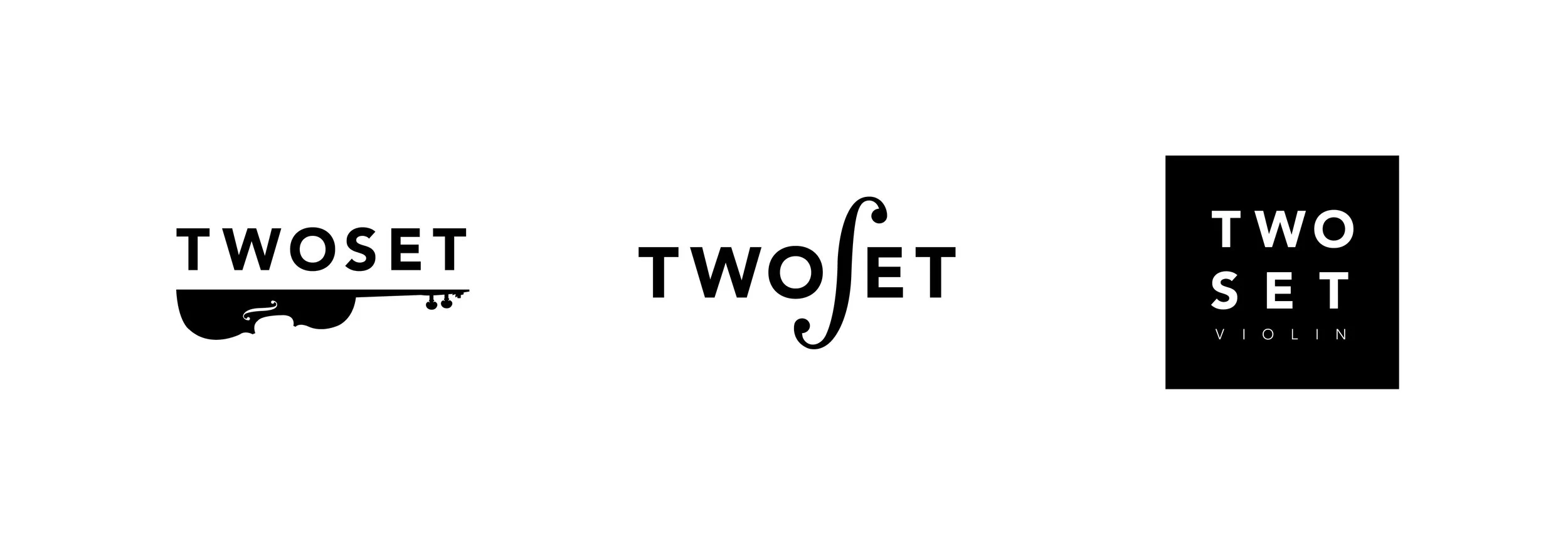
FINAL iterations
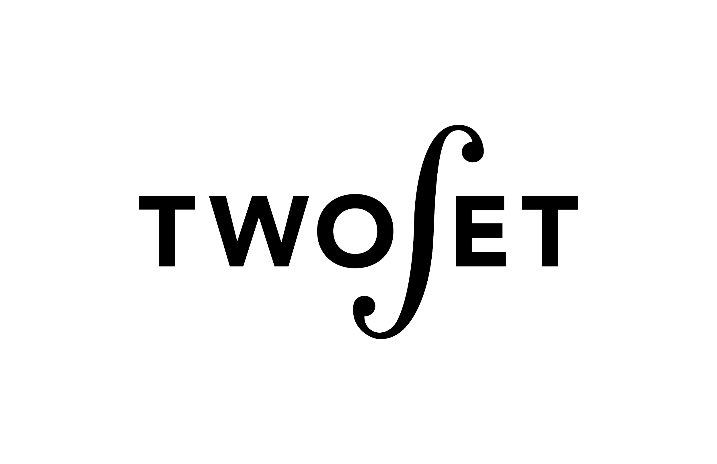
After choosing my top 3, I noticed that explicitly illustrating the violin felt predictable, resulting in lack of visual interest. On the other hand, keeping it minimalistic felt generic. I ultimately chose the middle logo as it dynamically implied the violin.
FINAL LOGO

→ PROCESS BOOK
Wanna see more? Click above to see more process work.
